





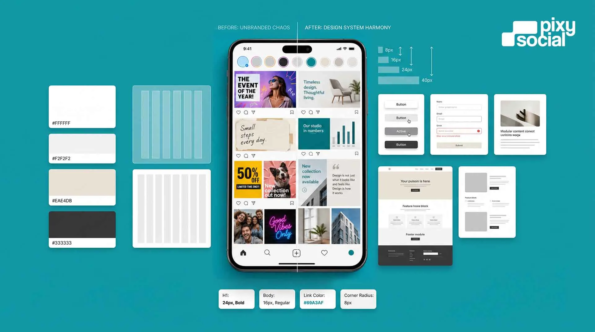

It is often not the logo. Most small business owners who feel their brand looks off have already spent real money on a logo — sometimes several iterations of one. The logo is rarely the problem. The problem sits a layer deeper, in the design system, or more accurately, in the absence of one. And in a city like Kolkata, where the consumer base is increasingly design-literate and the visual noise on every social feed is relentless, the absence of a design system is one of the most expensive mistakes a brand can make without realising it.
What a Design System Actually Is
A design system is the set of rules that governs how your brand looks everywhere it shows up. Your website. Your Instagram grid. Your WhatsApp business profile. Your proposals and invoices. Your packaging. Your storefront signage. Your ad creatives. The cover image on your Facebook page. A design system covers your colour palette and the specific hex codes that define it, your typography choices and the rules for when each typeface is used, your spacing and layout principles, your image and photography style, and the visual language that ties all of it together into something a customer would recognise as yours even if your logo was removed.
Without a design system, every new piece of content becomes a decision made from scratch. And decisions made from scratch under time pressure, by whoever happens to be available, using whatever tools and templates are nearby, accumulate into inconsistency. Inconsistency, more than any single bad design decision, is what makes a brand look cheap online. It signals to a viewer — at a subconscious level that happens faster than conscious thought — that no one is in charge of how this brand looks. And if no one is in charge of how the brand looks, the implication is that no one is particularly in charge of the business either.
The Specific Patterns That Signal an Unprofessional Brand
There are a handful of visual habits that consistently give small businesses away to anyone who knows what to look for. Each one seems minor in isolation. Together, they create an impression that is difficult to overcome, even for businesses with excellent products or services.
Inconsistent typography is one of the most common signals. Using three or four different fonts across a website, social media posts, and print materials — sometimes within a single post — communicates a lack of visual discipline that most consumers will not consciously identify but will absolutely feel. The brand feels chaotic and unresolved. Contrast this with a brand that uses two typefaces consistently — one for headings, one for body text — with clear rules about when each appears. That consistency creates a sense of intentionality that lifts the brand's perceived quality substantially.
Inconsistent colour usage is the second most common issue. Many small businesses in Kolkata have a logo colour, but no defined colour palette. The result is that every new design element — a social media post, a banner ad, a business card, a product label — introduces a slightly different shade because no one has the hex codes and everyone is colour-matching by eye. Over time, the brand's visual identity becomes a spectrum rather than a system. Customers who encounter the brand across multiple touchpoints feel a vague sense of dissonance without knowing why.
Stock imagery that does not belong together is a third signal. Many small businesses assemble their visual content from multiple stock libraries, choosing images based on what is available for free or cheap rather than on what fits a defined visual style. The result is a feed or website that feels like a collage — some images are warm and lifestyle-oriented, others are cold and corporate, others are illustrated, others are photographic. Again, no single image is necessarily a problem. The lack of a coherent visual logic is the problem, and it is immediately legible to a consumer deciding whether this brand is worth their attention.
For businesses in Kolkata, these issues matter more than businesses in smaller markets might expect. The city's twenty-five to forty-five demographic is genuinely design-literate. They have spent years consuming content from well-resourced national and international brands. Their visual standards have been set by those brands, whether they are conscious of it or not. When they land on a local business's Instagram grid or website and the visual identity feels inconsistent or unresolved, most of them leave. They do not stop to wonder whether the product is good or the service is worth it. They have already made a decision, and it happened in under three seconds.
What Good Brand Design Actually Requires
A functional brand design foundation does not require an expensive agency engagement or a months-long brand strategy project. It requires defining a small number of elements clearly and then applying them consistently. That is the entire job. The complexity people associate with brand design usually comes from not having done it systematically, which leads to endless renegotiation of decisions that should have been made once.
At minimum, a brand design system for a small or mid-sized Kolkata business needs the following. A colour palette of two to four colours with exact hex codes documented — not colour names, not screenshots, actual hex codes that can be entered into any design tool to produce exactly the right shade every time. Two typefaces with clear usage rules: one for headings and display text, one for body text and captions, with guidance on sizing and weight. A set of image guidelines covering the visual mood, typical subjects, and editing style that defines what on-brand photography looks like — not just what to avoid, but what to aim for. And a template library for the content formats your brand produces most often: social media posts, story frames, email headers, proposal covers, whatever appears most frequently in your marketing.
These are not luxuries reserved for brands with large budgets. They are the baseline infrastructure of a brand that looks like it knows what it is doing. And they are achievable for almost any business willing to spend a focused effort on getting them right once rather than making the same visual decisions badly over and over again.
The Cost of Not Having a Design System
The most common objection to investing in brand design infrastructure is budget. A design system costs money to develop properly. What most small business owners do not account for is the cost of not having one — which is real, ongoing, and compounding. Every freelancer, intern, or vendor who touches your brand without a reference document will make their own visual decisions. Some of those decisions will be fine. Many will be subtly wrong. All of them will require correction, briefing, or rework. The time and money spent on that constant course-correction, measured over a year, almost always exceeds what a one-time investment in proper brand guidelines would have cost.
There is also a less tangible but equally real cost: the cumulative effect on how your brand is perceived. Every inconsistent visual touchpoint erodes the authority and credibility you are trying to build. And in a competitive market like Kolkata — where a potential customer might encounter your brand on Instagram, visit your website, see a WhatsApp forward from a friend, and pass your store signage all before making a decision — those touchpoints add up. A brand that looks consistent and intentional at every one of those encounters builds trust incrementally. A brand that looks inconsistent loses it at roughly the same rate.
Where to Start If Your Brand Design Is Inconsistent Right Now
The most useful first step for a Kolkata business that recognises this problem in its own brand is a visual audit. Before changing anything, document what you have. Collect every current brand touchpoint — your logo files, your social media posts from the last three months, your website screenshots, your printed materials, your ad creatives. Lay them side by side and look honestly at whether they feel like they come from the same brand. If they do not, the audit will show you exactly where the inconsistencies are concentrated, which tells you where to focus the fix.
The second step is consolidation: defining the elements that should be fixed going forward and documenting them in a single reference file that anyone who works on your brand can access. This does not need to be a hundred-page brand book. It can be a single Canva document or a PDF with the hex codes, the font names, the image style direction, and three or four annotated examples of what on-brand content looks like. That document becomes the anchor for every future design decision, and it eliminates the need to renegotiate those decisions every time they come up.
The third step — which is where the real transformation happens — is applying the system consistently over time. A brand design system that exists as a document but is not followed consistently is nearly as ineffective as not having one. The goal is to make the system the default, so that producing on-brand content becomes the path of least resistance rather than an extra effort.
At Pixy Social, we treat brand design as infrastructure, not decoration. Every client engagement starts with an audit of existing visual assets and an honest conversation about what is working and what is creating friction. We build the system first — the colour palette, typography, image guidelines, and template library — so that everything that follows has a foundation to stand on. If your brand looks inconsistent online and you want to fix it properly rather than patch it, we would like to talk.
Fix your brand system →